Easy Fixes for Text-on-Image Conflicts
掌握三個設計技巧 圖文排版更和諧
Have you ever had problems placing text on top of photos? The colors either clash on certain letters, or the placement is just off? You may not care so much, but in the pursuit of PowerPoint perfection, minute details sometimes matter. To that end, we will cover how to use transparency, shadows and/or photo selection to solve this issue.
簡報中常會有把文字放在圖片上的排版,但要麼圖片顏色會把文字吃掉,要麼畫面過於豐滿而沒有地方放置文字。雖然不是特別大的問題,但為了追求投影片的完美,細節往往很重要。因此,我們今天將從透明度、陰影、挑選合適圖片這三點來和大家分享如何解決這個問題。
Sometimes, we just want to put some text on top of a nice photo. We may run into some color coordination issues, and have to place text in awkward positions to make it work. Or, we just end up putting it on top of the image hoping viewers will be able to read it anyway.
在一張很棒的圖片上放上文字,考慮到顏色協調我們不得不把文字放在一個尷尬的位置以便文字不會被吃掉;或者有人乾脆就直接放在圖片,這樣觀眾無論如何都會注意到它。
The human eye is powerful catching around 36,000 pieces of information and processing them in a single hour. Design distractions, like color clashes or misalignment, may not make or break your presentation, but the eye will passively catch it. In doing so, this would lead to some level of distraction, which ultimately compromises your delivery flow.
人類的眼睛可以在一小時內捕捉並處理大概 36000 條資訊。顏色衝撞或失調等設計上的干擾或許不會影響你的表現,但因為眼睛被動地接觸到相關資訊,在一定程度上造成分心,最終也會讓資訊傳遞的效果大打折扣。

Check out the above slides, which have problems with color coordination. Of course, we could move the text toward the sky, and the text will be more visible. However, do we have to compromise position due to color? What if I want to place the text in the middle of the photo?
上圖所示的兩張投影片就有明顯的顏色失和的問題。為了讓文字清晰可見,我們當然可以把文字上移到天空的位置。但如果不想因為顏色而妥協文字位置應該怎麼做呢?
We turn to contrast techniques to combat this dilemma. The first method we will explore is drop shadows that makes text readable with a 3D effect. Then, we will cover transparency, which produces a see-through layer between the image and text. Another method is finding specific photos that act as a canvas. Let’s dive deeper into each approach...
我們可以通過思考對比技術來解決這個問題。第一個方法是給文字加上陰影使其有3D效果而更好閱讀;第二個方法是透明度,增加一張圖片和文字之間彷彿隔了一張可以被看透的圖層。最後一個方法是找到一張可以充當底圖的特定圖片。
1. Drop Shadow 設置陰影

This tool works well with bright color fonts, as shadows are usually darker. In this case, the drop shadow has clearly outlined the top of the white text, which was blending in with the snow. The image above shows the options on the right toolbar, which pops up after you select the text object. Here, you can choose multiple options from angles to sizing, optimizing your shadow use. This is a simple fix, which takes some experimenting with angles and other presets.
陰影一般是深色的,所以這個工具可以很好的處理顏色明亮的字體。在這個例子,陰影的設置很好地勾勒出白色文字的頂部。上圖顯示了這個工具所在的位置,只要點擊文本,工具欄和相關選項便會出現。通過一些角度和其他預設的嘗試,就可以做出簡單的調整。
2. Transparency 調整透明度


Another simple hack, which can help let you use text freely with photos… is adjusting transparency with an added layer object. Most likely using a rectangle will be the best selection. Basically, just put the shape (rectangle) on top of the photo, then go to the formatting options. Find the transparency tool, and adjust the percentage according to what visually works best. Do make sure to right click the shape, and “send backward”, so this way it is layered in between the background photo and text.
第二個簡單的方法則可以讓你在圖片上自由使用文字,就是增加一個物件並調整它的透明度,最佳選擇是增加一個矩形。基本上只要把增加的那個圖形(矩形)放置在圖片上,到格式化選項,找到「透明度」工具,調整百分比以達到最佳呈現。記得要右鍵單擊這個形狀,選擇「往下一層」,才能讓這個圖層處於圖片和文本中間。
3. Photo Backdrop 背景照片
If you do not want to limit the photo’s pure essence by using transparency, choosing the right photo matters. There is nothing too complicated behind this method, you just have to seek images that contrast your desired font color and size. Some good image elements to look out for are…
如果不希望破壞原本圖片的明度或彩度,那麽選擇一張合適的圖片就很關鍵。這個方法沒有太複雜的步驟,只需要尋找一張和你所想要的字體顏色和大小能夠匹配的圖。以下元素可供參考:
Text-friendly image : these are stock images that have been made to accommodate incoming text inserts. In some sense, they can be considered templates for the exact purpose of including text on background images.
文本友好型:這一類型圖片的原創者在一開始便有意地留出適當位置可放置文本。
從某種意義上來說,它們可以被視為一種有圖片又有文字的模板。
如同下圖所示,紙筆下方的留空讓文本有很好的展示空間,而未放置文字的原圖則稍顯單調。


Large empty space : like text-friendly images, these photos are not purposely made for inserting text, but have open areas that text can efficiently be placed on. Most of these images are usually filtered to abstract or landscape stock photo categories. The popular modes of photos can range from buildings to outer space themes.
大留空型:圖片上有很多位置可以增添文字。大留空型的圖片並不像文本友好型圖片那樣是為了插入文本而設計的,但這類型的圖片還是有很多可以有效處理文本位置的開放區域。常見於比較抽象的類型。風景照便是一個很好的選擇。


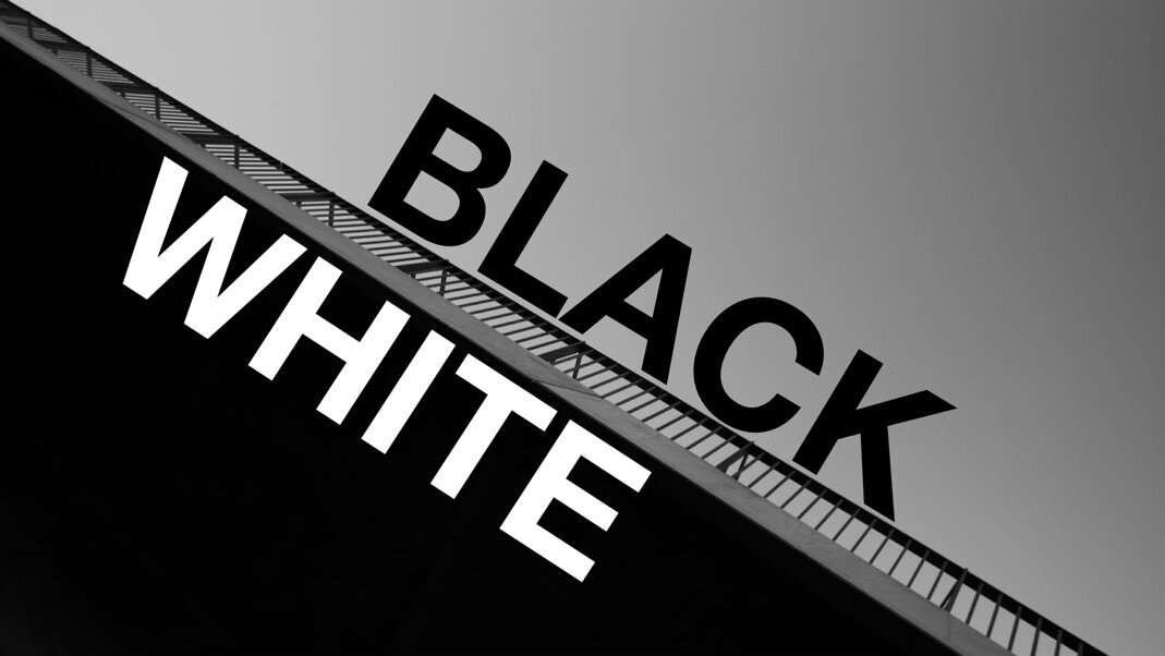
Black / white colors 黑 / 白
It may take some hunting for the “picture perfect” image, but it goes a long way in avoiding any visual distractions.
雖然尋找一張完美底圖會耗費一些功夫,但卻能夠很大程度避免之後觀眾視覺被分散。

From the above fixes to word/image visual conflicts, the goal is to allow users to place content wherever they desire. All the suggested tools are viable solutions, which are readily available in both PowerPoint and Keynote. These quick fixes can keep away those small distractions, allowing for a smooth presentation flow. Having the power to freely place text on images in primary positions without readability issues, will help boost design. Do not shy away from graphics and text, as slides are meant to be visual. Moreover, have a killer intro (cover) slide with an epic photo background and title.
以上幾個方法都是協助使用者將內容放在任何自己想放的位置,無論是使用 PowerPoint 還是 Keynote,那些工具都是立即可用的解決方案。這些方法可以避免視覺上的小干擾,讓你的表現更流暢。投影片本是視覺化的產物,所以不要迴避文本與圖形、圖片之間的結合。掌握把文本任意擺放在圖片上並且不會產生可讀性問題的能力,不僅可以提升自己的設計功力,還能獲得一張與眾不同的投影片頁面。
本文作者:BFA 簡報